Crafted with clarity and strength, it elevates communication and embodies KPC's position as a premier knowledge services organization.
The symbol mark is conceptualized as a circle representing the virtuous cycle created within the corporate ecosystem through productivity improvement, embodying the circulation and convergence of KPC's core values.
The circular motif above the "P" highlights KPC's symbol of "Productivity," while also representing Innovation in delivering premier knowledge services and Insight in offering creative solutions. The image of the circular motif inside the "P" rising and expanding beyond it embodies productivity improvement and the creation of customer value.
The "K" and "C," consistently designed with an open structure, symbolize KPC's commitment to building trust through an open stance that listens closely to customer voices.
The primary color, Red, represents KPC's standing as a leading productivity institution and premier knowledge service organization, while expressing its unwavering passion and commitment.
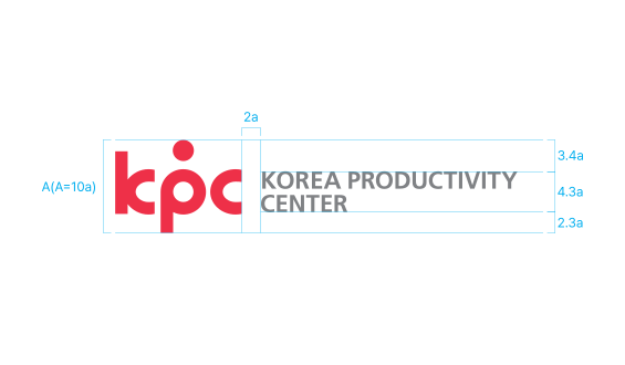
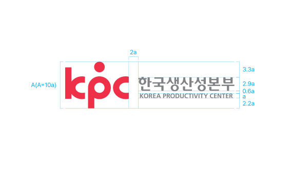
It is composed by combining the symbol mark and the logotype in appropriate proportions, allowing the suitable combination to be selected and used according to the application context.


KPC's colors must be applied consistently across various visual media to convey KPC's brand image, and therefore the color usage guidelines must be followed.
KPC Red 100%
KPC Red 70%Slogan Color
KPC Gray